Council of Yukon First Nations
How the First Nations Regional Health Survey found one clear voice
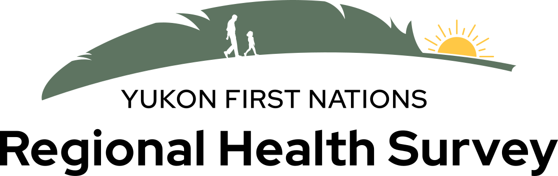
MBDC designed a new logo and brand guide for the First Nations Regional Health Survey, giving Yukon’s health programs one clear, culturally grounded voice.
Challenge
The First Nations Regional Health Survey, known as the RHS, has been carried out by and for First Nations since 1997. It measures health and wellbeing among First Nations living on reserve and in northern communities, and across the Yukon’s 14 First Nations its data shapes the programs that local health organizations, tribal councils and government agencies design. But the survey’s branding had drifted. Different platforms showed different versions, which muddied the message, and there was no single guide to point to. Practical questions came up constantly: how should the logo sit beside other logos, which typefaces and colours are correct, what kind of imagery belongs here?
Solution
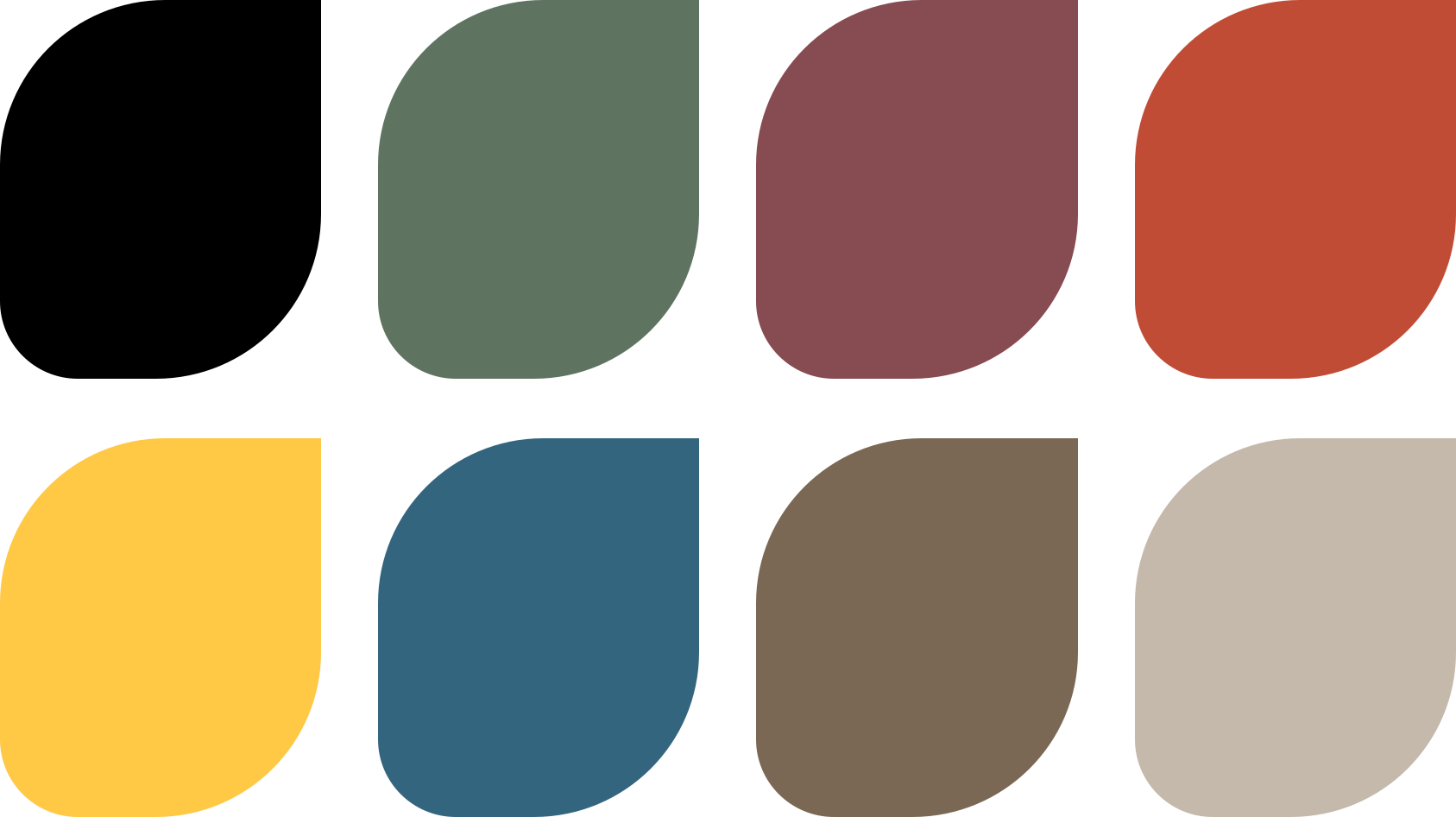
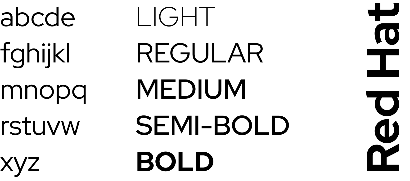
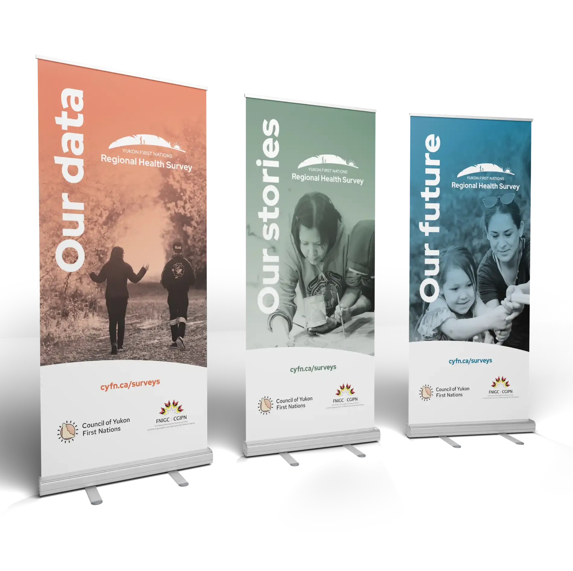
We designed a new logo and a full brand guide. The guide opens with what the RHS is for and what it values, so anyone picking it up starts with the point rather than the pixels. From there it covers logo usage, including how to pair the mark with other organizations’ logos, typography and colour, and a clear approach to choosing imagery that reflects the survey’s purpose.
Results
Designers and campaign managers now have one place to check, and the answer is the same every time. The RHS shows up as one organization wherever it appears, which is what a survey that asks communities for their trust should look like.