Western Arctic Moving Pictures
Northern lights, camera, action. WAMP’s digital renaissance
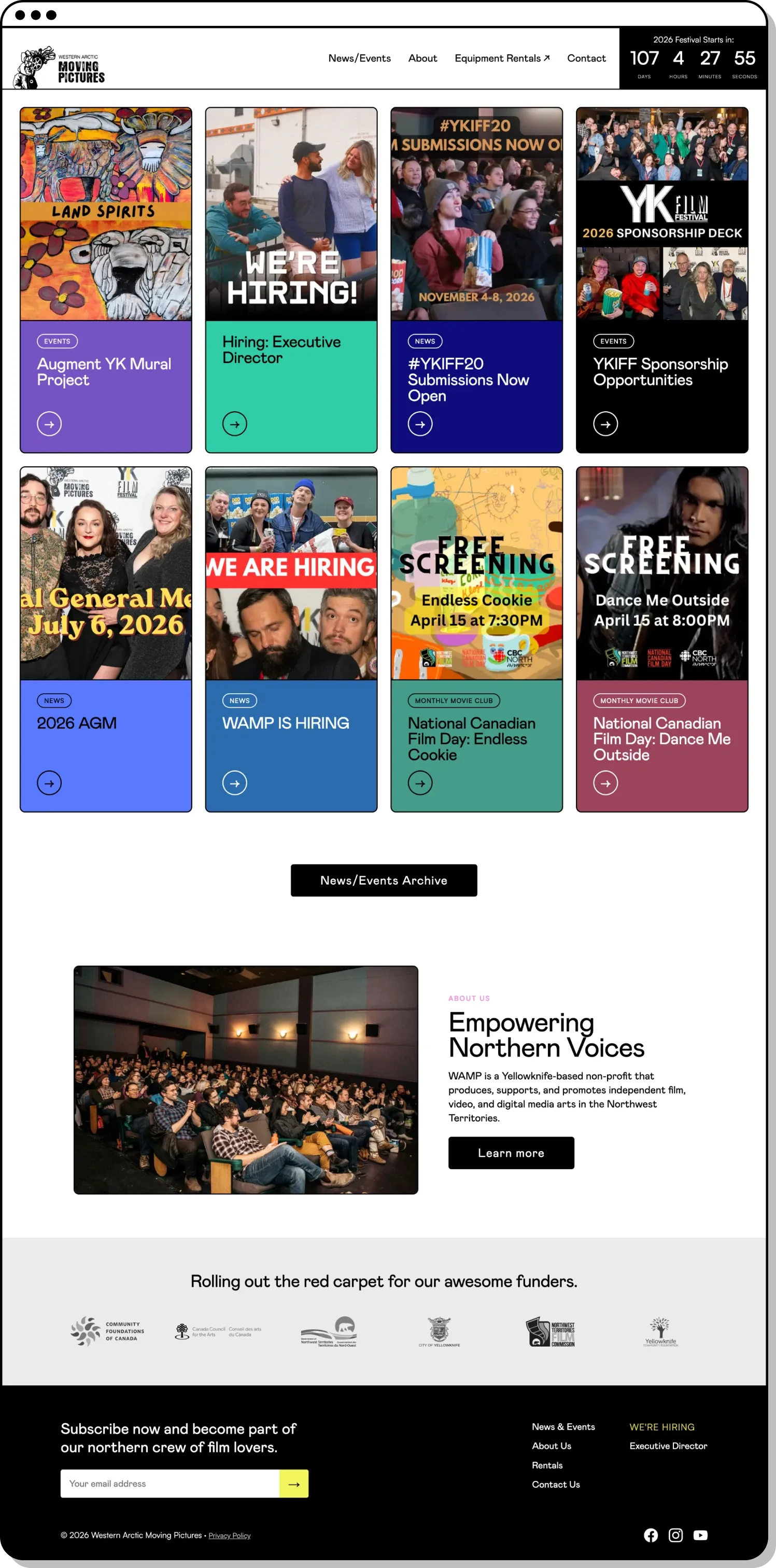
MBDC rebuilt the Western Arctic Moving Pictures website into a vibrant, easy-to-navigate home for digital media arts in the Northwest Territories.
Challenge
Since 2001, WAMP has been the engine behind independent film and digital media in the Northwest Territories: equipment, workshops, mentorship, and the Yellowknife International Film Festival. Its old website couldn’t keep up. Outdated design and tangled navigation hid the breadth of what WAMP offers and undersold the vibrant community behind it. The organization needed a site as creative and energetic as the filmmakers it serves.

Solution
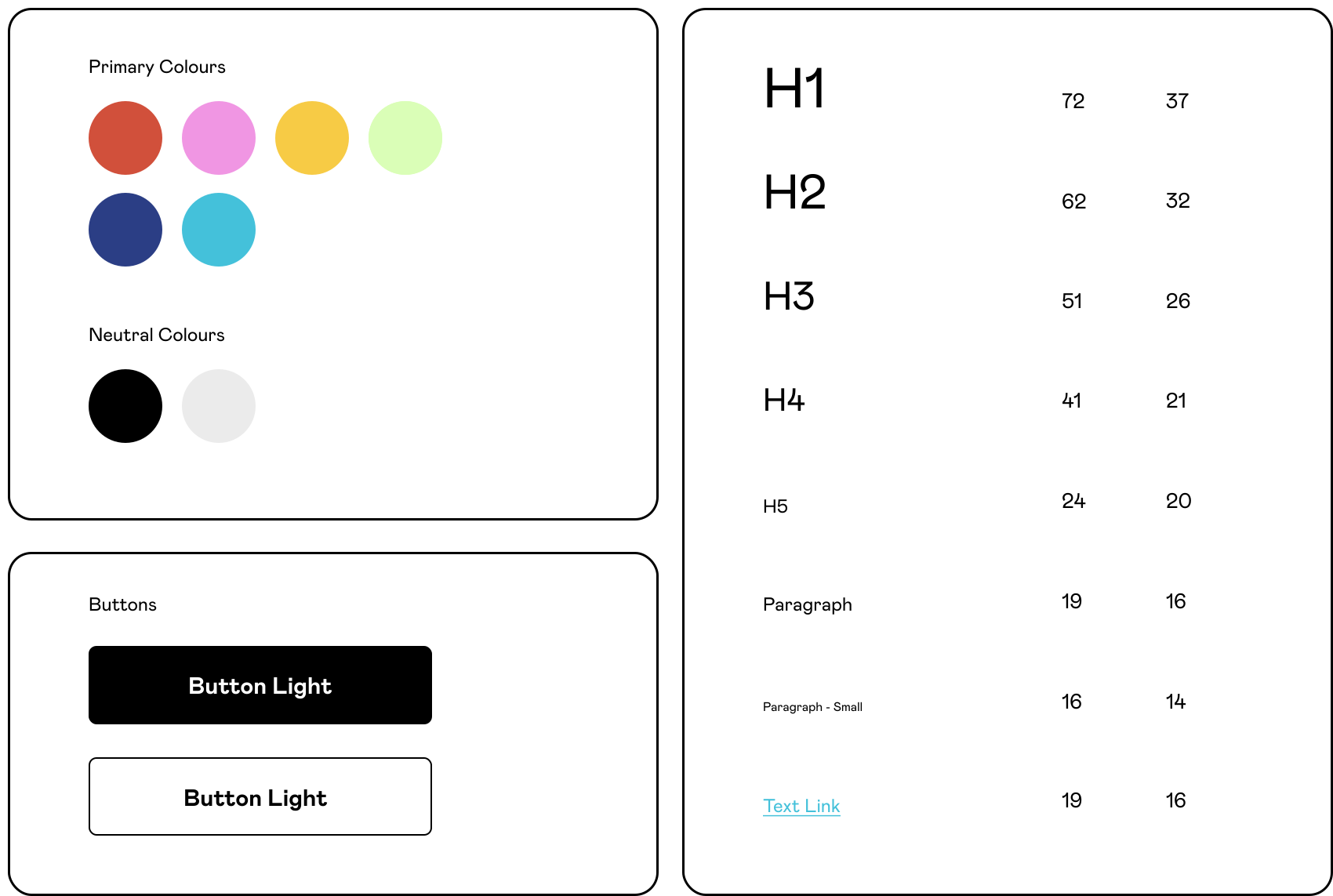
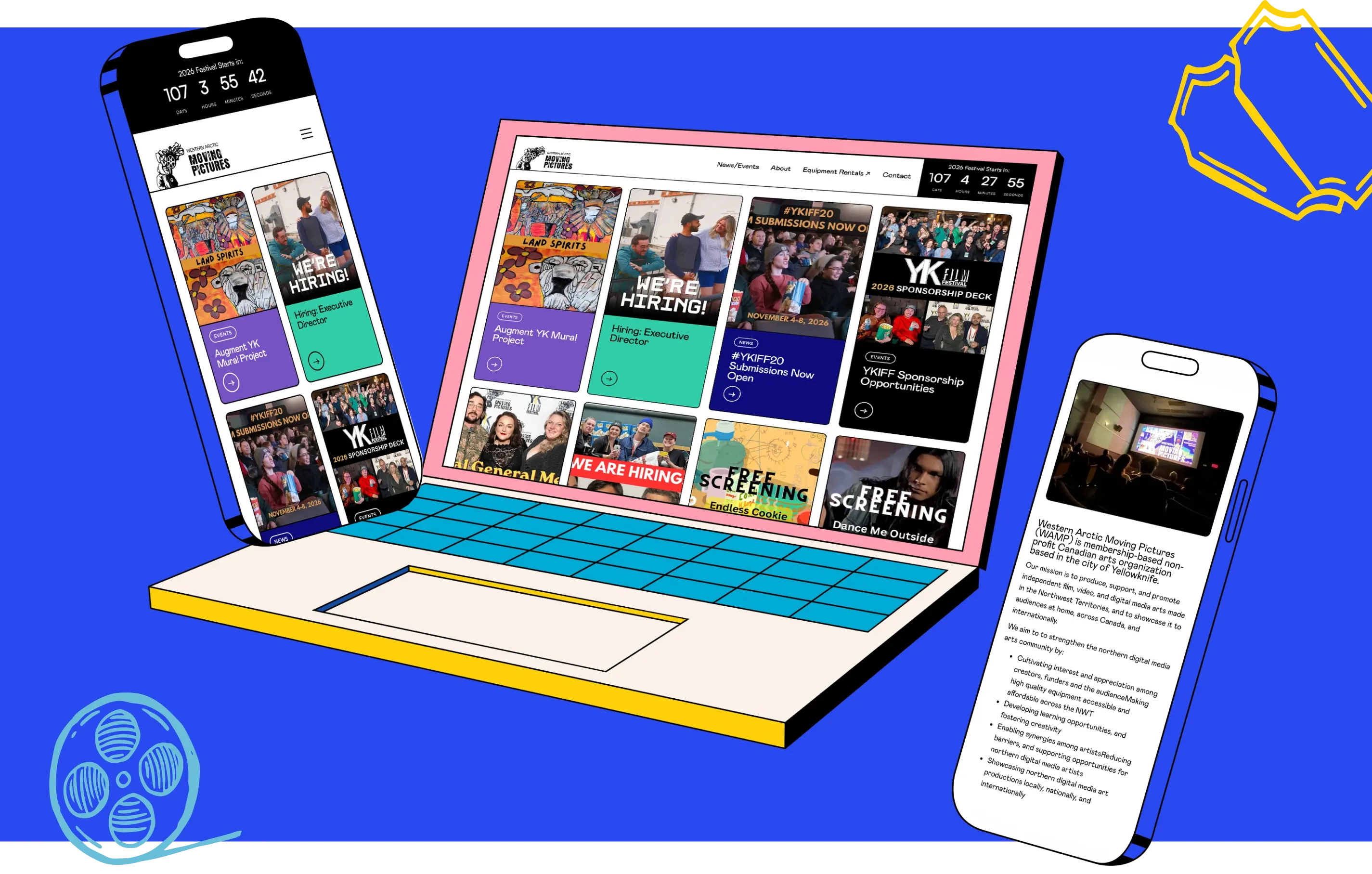
We rebuilt WAMP’s home with a clean, modern design, intuitive navigation, and a bold palette of teal, purple, orange and navy that finally matches the community’s energy. High-quality imagery puts the work front and centre, engagement tools spotlight programs and equipment rentals, and an Eventive integration powers a proper festival guide for the Yellowknife International Film Festival. Built on Astro and Directus, the site is fast, mobile-friendly and simple for the WAMP team to keep current between festivals.
Results
WAMP’s new site is the clear standout, reaching 14,241 people and more than 61,000 page views over the past year, up 54% and 79%, with visitors staying an average of over a minute per session (up 16%) and viewing more than four pages each. It’s built well under the hood too, quick to load, highly accessible and easy to discover. For an organization built on showing great work to as many people as possible, that reach is exactly the result to celebrate.