Yukon University
How Yukon University put its new brand to work
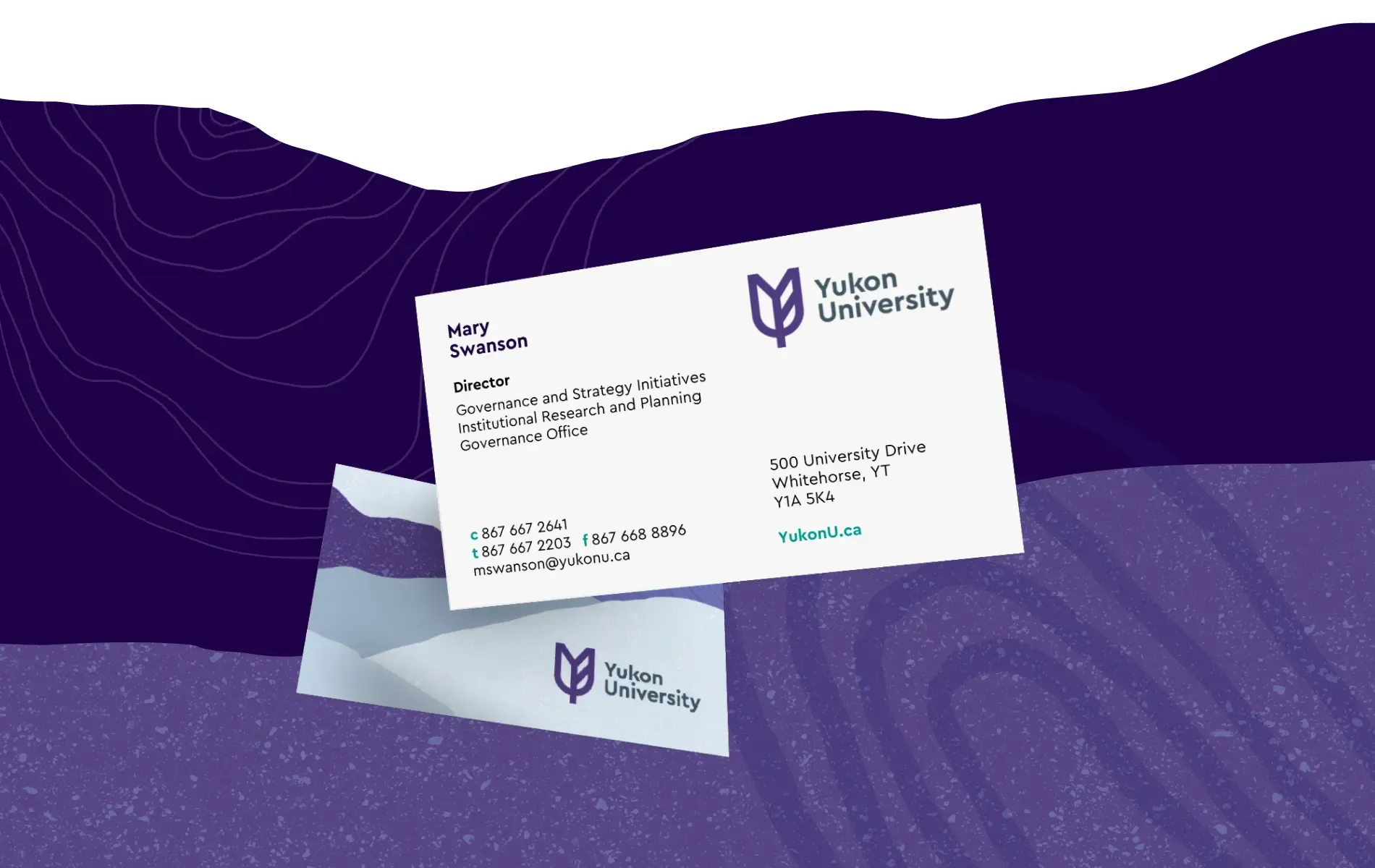
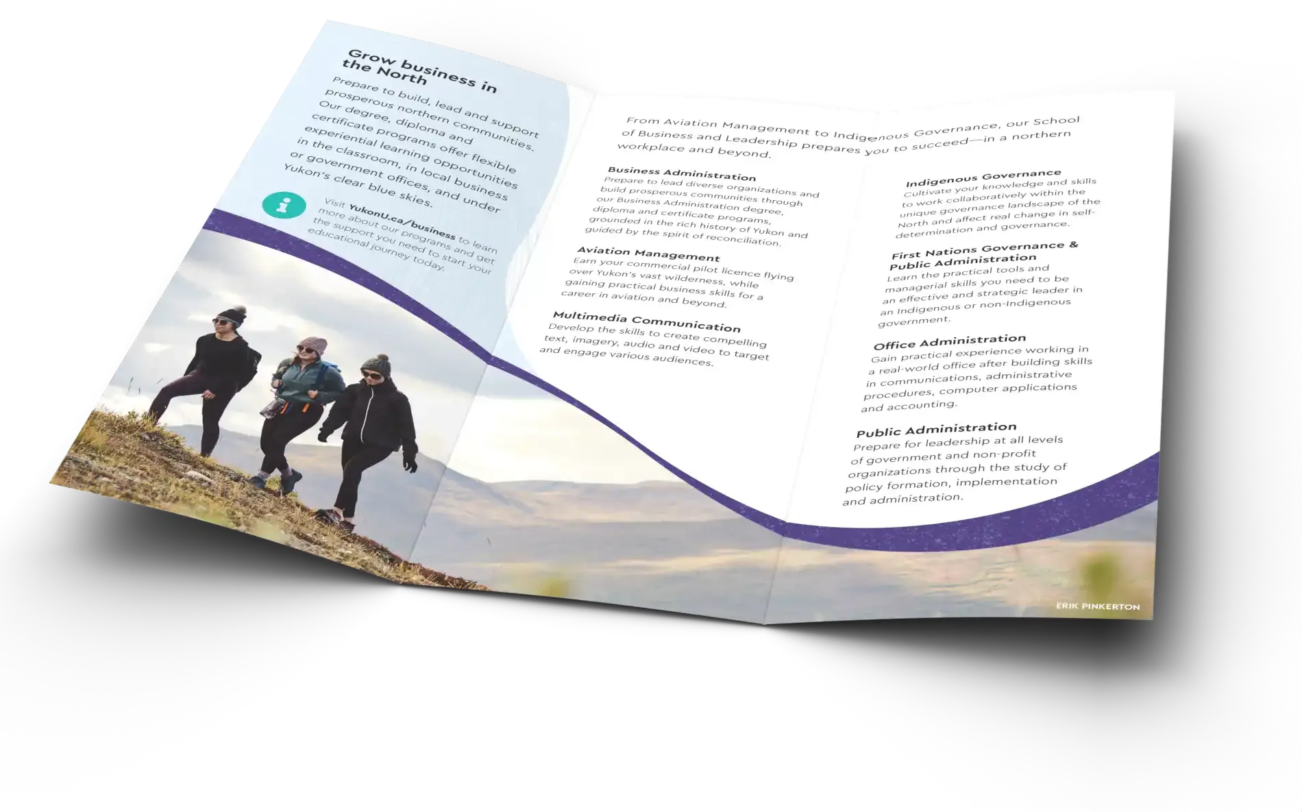
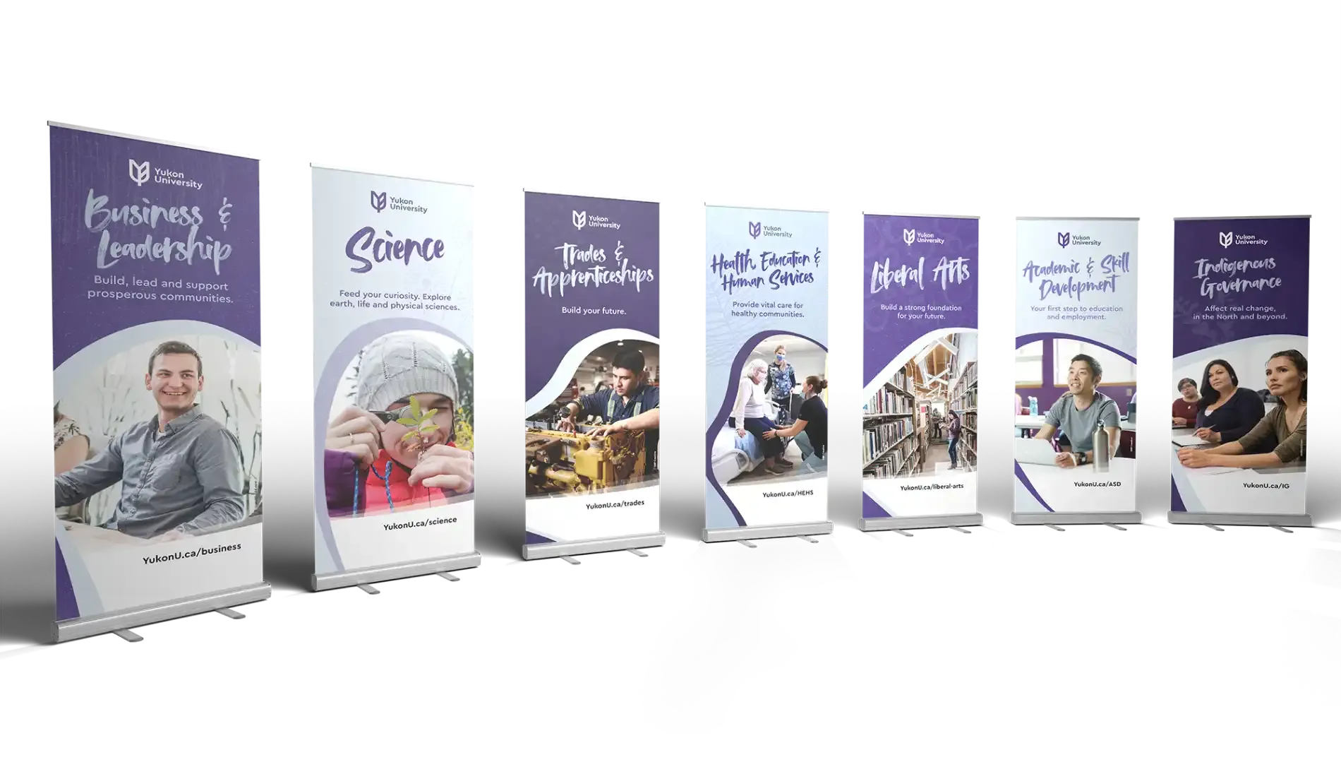
MBDC helped Yukon University roll out its new brand across business cards, ten brochures, letterhead, envelopes and pop-up banners for 14 campuses.
Challenge
Yukon University has been a cornerstone of northern education for over fifty years, from a vocational training centre in the 1960s to a comprehensive college by the 1980s and, in 2020, a university, with a new brand to mark the change. The identity work had been contracted to an outside agency, with the plan that Yukon U would produce its marketing collateral in-house afterward. Then the guidelines landed and the team realized they didn’t have the capacity to build everything on the schedule. They needed help, quickly.

Solution
We showed the Yukon U team how the new logo, colour palette and brand elements could work together as a system, then built the pieces. A business card template that hundreds of staff across 14 campuses could use, instantly recognizable, so every card projects the same collective authority. A set of ten brochures, from a simple trifold to an intricate double parallel reverse fold with tabs. Letterhead, envelopes and pop-up banners to finish the set.
Results
Hundreds of staff across 14 campuses now hand out the same card, and every brochure, envelope and banner reads as one university. The brand went from a guideline document to something people could pick up, on time.